
Color Theory for Beginners: How to Choose the Right Colors for a Website
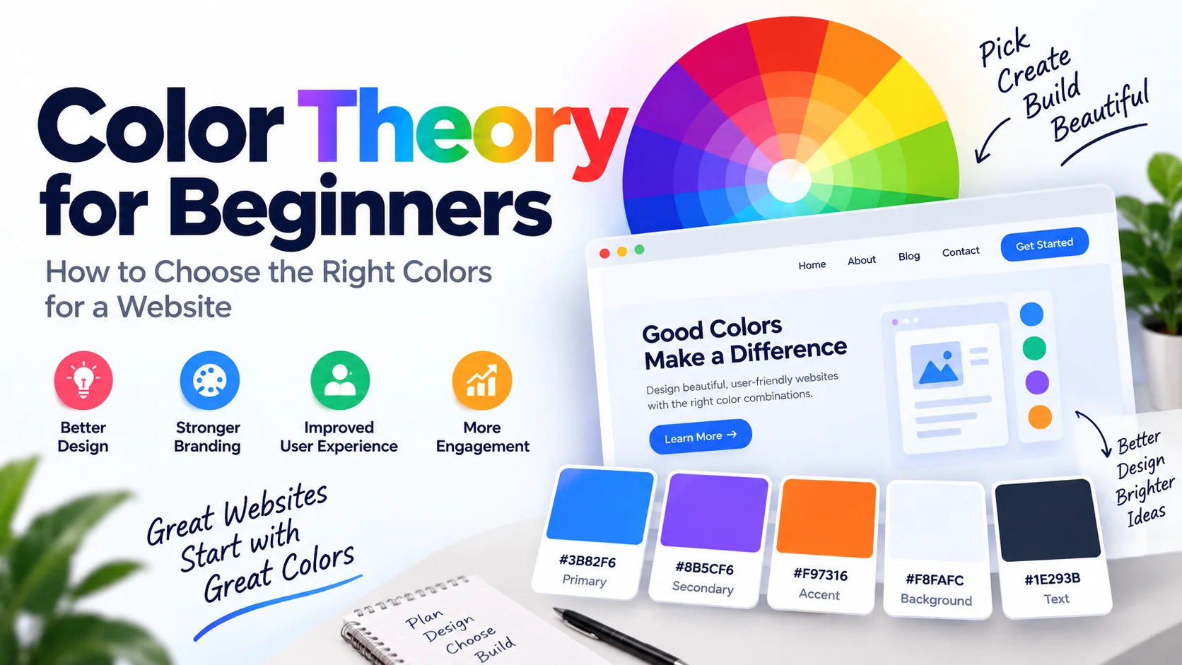
Choosing colors for a website sounds easy until you actually have to do it. You pick a blue you like, add another color that looks nice, choose a background, and suddenly the page has five different shades fighting for attention.
The problem usually isn't a lack of colors. It's a lack of a clear plan. Good website colors are not chosen randomly. They work together to make the content easier to understand, important actions easier to find, and the overall design feel consistent.
This is where color theory becomes useful. You don't need to be a professional designer to understand it. A few basic ideas about color relationships, contrast, and balance can make a big difference when you're designing a website.
In this guide, we'll start with the basics and then move into practical website design. By the end, you'll know how to choose a primary color, create a simple palette, use HEX and RGB values, pick readable text colors, and avoid some of the most common color mistakes.
What Is Color Theory?
Color theory is the study of how colors relate to each other and how different combinations affect the way a design looks and feels.
For web designers, color theory is less about memorizing complicated rules and more about understanding relationships.
For example, imagine a simple website using these colors:
#2563EB for buttons,
#F8FAFC for the background, and
#1E293B for the main text.
None of these colors are complicated. What makes them work is that each one has a purpose.
That's the main idea behind color theory: don't just choose colors that look good individually; choose colors that work well together and have a clear job.
Why Color Matters in Web Design
Color is one of the first things people notice when they open a website. Before reading your headline or clicking a button, visitors are already seeing your color choices.
A good color system can help with several important parts of a website.
1. It Creates a First Impression
A website with a consistent palette can immediately feel more polished. A page with random colors, on the other hand, can feel unfinished even when the underlying layout is good.
2. It Builds Brand Recognition
Using the same colors throughout your logo, buttons, links, illustrations, and other interface elements makes your website easier to recognize.
3. It Guides the User
Color can tell users where to look next. A strong accent color can draw attention to a button, while a softer color can keep secondary information in the background.
4. It Affects Readability
Color also has a practical job: helping people read your content. Beautiful colors are not useful if your text blends into the background.
Understanding the Color Wheel
The color wheel is one of the simplest ways to understand relationships between colors.
In traditional color theory, the main primary colors are red, yellow, and blue. Combining these colors produces secondary colors such as orange, green, and purple.
There are also tertiary colors, which sit between primary and secondary colors. This gives us a wide range of shades that can be used to create different combinations.
Digital design works a little differently because screens use the RGB color model, but the color wheel is still useful for understanding how colors relate to one another.
Warm Colors vs Cool Colors
Colors are often divided into two broad groups: warm and cool.
Warm Colors
Reds, oranges, and yellows are generally considered warm colors. They can make a design feel energetic, active, friendly, or attention grabbing.
For example, an orange button can feel more energetic than a muted gray button.
Cool Colors
Blues, greens, and many shades of purple are generally considered cool colors. They can create a calm, clean, modern, or professional feeling.
This is one reason blue appears so frequently in technology, communication, and business websites.
These associations are not strict rules. A color can feel completely different depending on its shade, surrounding colors, typography, imagery, and the type of website you're designing.
The Main Types of Color Harmony
Once you understand the color wheel, you can start creating color harmonies. These are combinations based on relationships between colors.
Monochromatic
A monochromatic palette uses different shades and variations of one color.
For example, a blue palette could contain:
#1E3A8A
#2563EB
#60A5FA
#DBEAFE
This approach is easy to manage and can give a website a very clean and consistent appearance.
Analogous
Analogous colors sit next to each other on the color wheel. Blue, blue-green, and green are a simple example.
Because the colors are closely related, analogous palettes often feel smooth and natural.
Complementary
Complementary colors sit opposite each other on the color wheel. Blue and orange are a popular example.
Complementary combinations can create strong contrast, which makes them useful for buttons, highlights, and calls to action.
The trick is not to use both colors equally everywhere. Usually, one color acts as the main color while the complementary color is used more selectively.
Triadic
A triadic palette uses three colors spaced evenly around the color wheel. It can produce a lively and balanced design, but using three strong colors at the same intensity can quickly become too much.
If you're a beginner, start with one dominant color and use the other colors as supporting or accent colors.
What Is a Color Palette?
A color palette is a selected group of colors that are used consistently throughout a design.
A basic website palette might contain:
- Primary color for major interface elements
- Secondary color for supporting elements
- Accent color for important highlights
- Background color for page sections
- Text color for readable content
You don't have to use five completely unrelated colors. In fact, a good palette often contains only a few main colors plus lighter and darker variations.
A Simple Website Palette Example
Here's an example of a practical palette for a modern website:
Example Website Palette
Primary:
#4F46E5
Secondary:
#7C3AED
Accent:
#F59E0B
Background:
#F8FAFC
Text:
#1E293B
The important part isn't the exact colors. It's how they are assigned. The primary color gets most of the attention, the accent color is used carefully, and the neutral colors make the content comfortable to read.
How Many Colors Should a Website Have?
There is no magic number that works for every website. However, if you're just starting, keeping your main palette small is a good idea.
A useful starting point is one primary color, one supporting color, one accent color, and a few neutral shades.
The mistake is thinking that every color needs to appear everywhere. Your accent color might only appear on a few buttons or important messages.
In design, less can often do more. If everything is colorful, nothing feels particularly important.
Why Color Contrast Is So Important
A color combination can look attractive and still be difficult to use. This is especially common with text.
For example, light gray text on a white background may look minimal, but it can be tiring to read.
Compare that with a darker text color:
#94A3B8
vs.
#1E293B
The darker color will generally provide a stronger contrast against a light background.
When designing a website, always check important text, buttons, links, and interface controls against the background they're placed on.
Think About Accessibility
A good website should not depend on color alone to communicate important information.
For example, imagine a form that shows errors only by changing the input border to red. Someone who has difficulty distinguishing certain colors may not notice the difference.
A better approach is to combine color with another visual or textual indicator, such as an error icon and a short message.
The same principle applies to success messages, warnings, charts, and status indicators.
Designing a Dark Mode Palette
Dark mode isn't simply a matter of changing
#FFFFFF to #000000.
A good dark interface usually uses several layers of dark neutral colors.
For example:
Example Dark Mode Palette
#020617 — Main background
#0F172A — Surface
#1E293B — Card
#F8FAFC — Main text
Notice that the background, surface, and card colors are not all identical. Small differences between them can help create depth without relying on bright borders.
Don't Use Bright Colors Everywhere
One of the easiest mistakes to make is using your strongest colors on every part of the page.
If your buttons, headings, cards, icons, backgrounds, and borders are all bright, the visitor won't know where to look first.
Strong colors work best when they have a reason to be there.
Think of your brightest color as a spotlight. You don't want to point that spotlight at everything on the stage.
Common Website Color Mistakes
Using Too Many Unrelated Colors
A website doesn't become more professional simply because it contains more colors. If the colors don't have a relationship, the interface can quickly feel chaotic.
Using Low-Contrast Text
Light gray text may look modern, but if visitors struggle to read it, the design has failed its most basic job.
Making Every Element Colorful
Your navigation doesn't need one color, every card another color, and every button a third color. Repetition creates consistency.
Copying a Palette Without Understanding It
You may find a beautiful color palette online, but that doesn't mean it will automatically work for your website.
A color palette that works for a photography portfolio may be completely wrong for a banking website.
Ignoring the Actual Website
Five color swatches can look perfect in isolation. Once you place them next to real text, images, cards, forms, and buttons, the result may be very different.
Always test your palette in an actual interface.
How to Create a Website Color Palette Step by Step
If you're starting a new website and don't know where to begin, here's a simple process you can follow.
- Understand the website. Think about the industry, audience, and personality of the project.
- Choose one primary color. This becomes the main visual identity of the interface.
- Choose a supporting color. Pick something that works naturally with your primary color.
- Add one accent color. Use it carefully for important actions or highlights.
- Select neutral colors. Choose colors for backgrounds, borders, headings, body text, and secondary text.
- Check contrast. Test text and interactive elements against their backgrounds.
- Build a real page. Don't judge the palette only from color swatches. Test it with real content.
Example: Building a Palette From One Color
Let's say you start with this blue:
#2563EB
Instead of immediately choosing four completely unrelated colors, you can create different variations around it.
Blue Color Scale
#DBEAFE
#93C5FD
#2563EB
#1D4ED8
#1E3A8A
Now you already have colors that can be used for backgrounds, borders, hover states, buttons, headings, and other interface elements.
Use a Color Palette Generator to Explore Ideas
You don't have to manually create every color combination yourself. Sometimes you know the general color you want but need help finding supporting colors that work with it.
That's where a color palette generator can save time. Instead of opening a design application and testing colors one by one, you can generate different combinations and compare them quickly.
If you're working on a new website, you can try Kivixa's Color Palette Generator to explore different color combinations and get HEX values that you can use directly in your design or CSS.
A useful workflow is to generate a few palettes first, choose the one closest to your project's personality, and then test those colors in your actual website layout.
Don't Forget About Hover and Active States
Choosing the normal button color is only part of the job. Interactive elements also need visual states.
For example, if your main button is:
#4F46E5
you might use a darker shade for the hover state:
#4338CA
This small change gives users visual feedback when they move their pointer over the button.
The same idea can be used for links, form fields, navigation items, and other interactive components.
Test Your Colors on Real Content
This is one of the most important steps and one that is easy to skip.
Don't decide that your palette is perfect just because five color boxes look good together.
Put the colors into a real page and test:
- Headings
- Paragraphs
- Buttons
- Links
- Cards
- Forms
- Navigation
- Images and illustrations
- Hover and active states
- Light and dark sections
You may discover that a color that looked perfect as a swatch is too bright for a large background or doesn't provide enough contrast for text.
Color Theory Is a Guide, Not a Rulebook
Once you understand the basics, don't be afraid to experiment.
Color theory gives you a starting point, but good design isn't about following a fixed list of rules. Context matters.
The same orange can feel playful on one website and premium on another. The difference might come from the typography, spacing, photography, layout, and the other colors around it.
Instead of asking whether a color combination is "correct," ask whether it helps the visitor understand and use the website.
Final Thoughts
Choosing website colors becomes much easier once you stop treating it as a guessing game.
Start with one strong primary color, build a small supporting palette, add an accent color where it actually helps, and use neutral colors to keep the interface comfortable.
Learn the basics of color harmony, understand the difference between HEX, RGB, and HSL, and always pay attention to contrast and readability.
Most importantly, test your colors in a real interface. A palette that looks beautiful in a color picker isn't necessarily a good website palette until it works with actual content.
And if you're not sure where to start, experiment with a few different combinations using a color palette generator and then refine the result for your project.
Good website design isn't about using more colors. It's about using the right colors in the right places.